Table of Contents
- Who should I reach out to? And where are they?
- Initial EDA
- Building Customer Segmentation
- Predicting Customer Response
- Conclusions
Disclaimer: This article and data for the development of the code are part of my submission Udacity’s Data Science Nanodegree program.
Who should I reach out to? And where are they?
These are common questions to every sort of business. Especially B2C companies that reach out directly to consumers. Thankfully, Data Science can help us better pinpoint the niches within possible markets/ population.
In this specific article, we will be covering data for Arvato-Bertelsmann. The data provided belongs to a mix of german general population demographic data and data from one of the company’s clients: an organics mail-order comapny.
This is a two-part analysis. The first part will be an unsupervised cluster generation and interpretation of the census data vs current customers. This helps us understand which characteristics better define our customer base.
The second part will be a supervised learning problem to predict responses to marketing actions. This can help us predict which people have the highest probability of becoming customers after marketing efforts.
To answer these questions, we have 4 tables:
- 2 .csv files with demographic data. One is the general population data, the other is the customer base.
- 2 other .csv files with the Mailout information. One is the training data and the other was supposed to be the test data. But for this article, only the training data will be used.
Note: The test data for mailout information was supposed to be used as part of a Kaggle competition entry that no longer exists. This is why only the training data was used, since it has labels for scoring and model evaluation.
There were also 2 auxiliary tables that represented a documentation regarding the available variables and how to interpret the encodings of categorical variables.
All files use “;” as the separator between values.
An observation at stage is necessary: Due to terms and conditions of the data, the data cannot be shared and thus will not be found anywhere except within the Udacity Data Science Nanodegree context.
With all the context set, lets get into the analyses. The methodology is the following: We first do an Exploratory Analysis of the Data and check for its consistency. This way, we can define any preprocessing steps to get the best out of our data.
Then, we go to the unsupervised stage, where we try to build segments that might help us understand the companies customer base.
At last, we move to the modelling, where we attempt to build a model to predict wether a person answers to a mailout campaign or not.
Before we continue, this article is also available on my Medium, if you like it better
Initial EDA
The general census data contains 891221 rows by 366 columns. The variables are divided into different groups, where each one means a different thing. For instance there is a group regarding automobile ownership information, other blocks regard the surroundings of the respondent.
The rows represent one respondent’s responses. Each respondent is represented by an anonym ID called “LNR” in the database.
Fixing CAMEO_ columns
There are 3 columns in the data (CAMEO_DEUG_2015, CAMEO_INTL_2015 and CAMEO_DEU_2015) that raise a warning about mixed types in Data. This happens because the values “X” or “XX” show up on them, when they should be numeric types (int or float). Since there is no description on the documentation of what these values are supposed to be and since they are different to the possible values in the columns, they were replaced as NaNs.
Fixing Documentation - Removing undocumented columns
Another problem found was that not all columns were in the documentation, on either of the two auxiliary files. This generated 3 scenarios:
- The naming of the column was incorrect, but it was in fact documented (salvageable);
- The column name was self-explanatory enough to be associated to other columns that had similar encodings and names (salvageable);
- The column was, effectively, missing from the documentation (unsalvageable).
The most critical case would be the last one. When we don’t have a clear meaning to the feature we can’t assure its usefullness. Therefore, columns considered unsalvageable were dropped.
The steps taken to set the not found columns were:
- Get column names not in the documentation
- A first automatic attempt to match columns by appending common strings to the names
- A second manual verification to see if the names coincide heavily with other columns in the docs and, therefore, we can infer the meaning of the not found columns.
- The columns not found after these two steps, were dropped.
31 columns were dropped by this process.
Also, with the documentation now fully representing the data, the files could be used to:
- Correlate the column names to their data types (float, int,…) and variable type (numeric, interval, nominal or binary)
- Correlate the column names to the variable group they belonged to
- Correlate the column names to their respective NaN values that could be encoded differently
To build these correlations, especially variable type, changes were made manually to the files or new files were created in a format that made fetching the documentation’s information in an easier manner.
NaN Handling
Given the (now fixed) documentation on the value of the columns, we can extract information from the documentation to replace values that map from “unknown” to NaN.
By ingesting this information and considering that strings that contain “unknown” in the meaning of the encoding represent NaNs, we can build a dictionary for each column to map its corresponding NaN values using pandas’ .replace() method:
df_attributes[['Attribute','Description']] = df_attributes[['Attribute','Description']].fillna(method='ffill')

# Assuming, from manual inspection from the 'Values' Spreadsheet, that NaNs are represented with substrings in Meaning col
nan_val_df = df_attributes[df_attributes['Meaning'].str.contains('unknown',regex=True,na  = False)].copy()

nan_val_df['Value'] = nan_val_df['Value'].str.replace('\s','', regex = True)

nan_val_df['Value'] = nan_val_df['Value'].str.split(',')

nan_val_map = dict(zip(nan_val_df['Attribute'], nan_val_df['Value']))

# Reshaping the dictionary for .replace
nested_nan_map = {}
for k, v in nan_val_map.items():
    nested_nan_map[k] = {int(val):np.nan for val in v}

# Mapping values to NaN
census = census.replace(nested_nan_map)
Column Elimination - NaN Proportion
After mapping the NaNs to each column, we can check for high incidence of NaNs column-wise.
Columns with a high percentage of NaN values can be discarted because they probably do not provide any sort of valuable information regarding the general properties of the population, which makes building inferences/ insights around them risky.
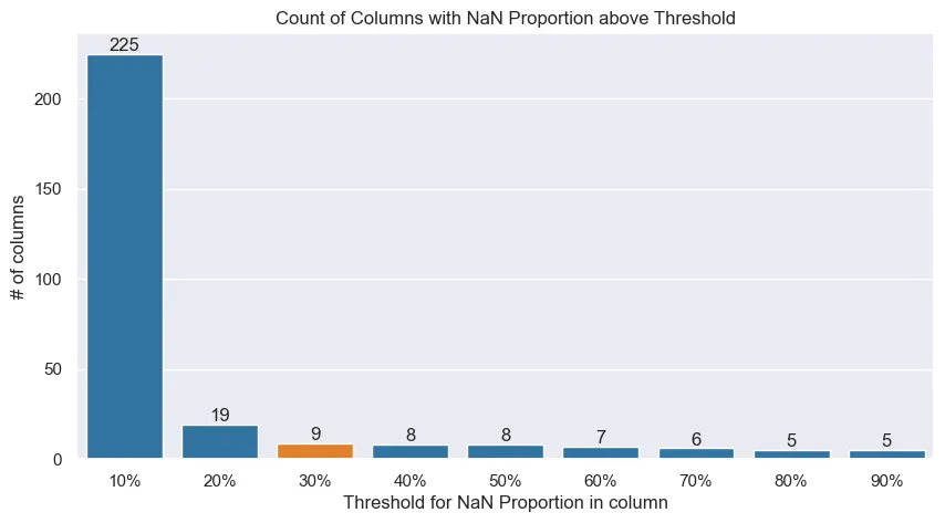 Columns with a proportion of NaNs above the threshold, would be dropped.
Columns with a proportion of NaNs above the threshold, would be dropped.The proportion threshold is a somewhat arbitrary definition. The plot above helps us understand the reasoning to why select 30% as the maximum threshold to drop a column.
If a threshold of proportion of NaNs ≤ 30% is chosen, we drop 9 columns that do not meet this criterion and manage to retain other columns in which we can impute values. Having in mind that the amount of columns that would be dropped if a 50% threshold was selected is 8 and that the cut for 20% might be too conservative, 30% was deemed as an appropriate cut.
Numeric Variables Distributions
With unused columns dropped and types appropriately fixed, we can look into some of the distributions to get some insight on the variables.
Broadly speaking, the numerical variables either needed no transformations or required to be binarized. One variable needed to be dropped.
In general, numerical variables are left-skewed as shown below:
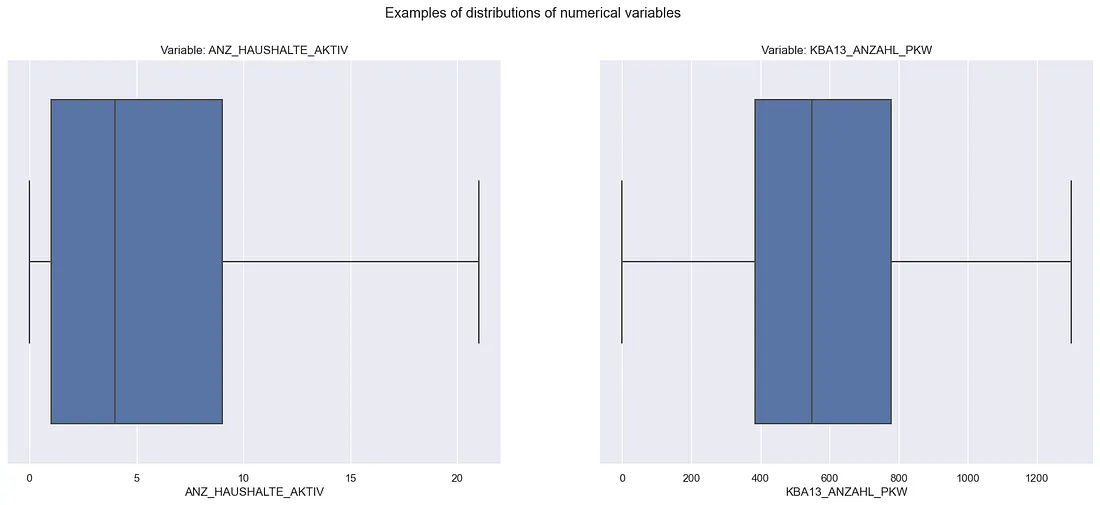 Box-Plot of numerical distributions’ examples
Note: The fliers (dots beyond whiskers) were ommitted to help the visualization
Two variables needed to be binarized: ANZ_HH_TITEL and ANZ_KINDER. This was because they had, respectively, 86.43% and 82.05% of zeroes in them. On top of that, both of them showed a dominance in low discrete values. These aspects makes it really hard to consider these variables as numeric when approaching any problem. Therefore, they were binarized to represent wether or not they had that attribute.
GEBURTSJAHR was the dropped variable. It had 44.02% of YoB as 0. Therefore, from every 10 answers, 4 wouldn’t have a YoB. Since we also have a variable that represents the age category of the respondents (ALTERSKATEGORIE). This variable was dropped.
The binarization occurred on the preprocess stage, which will be covered in the coming section.
Categorical Variables Distributions
Categorical variables were more looked into especially for the interval variables. Some variables presented too many categories that not necessairly were informative, such as below:
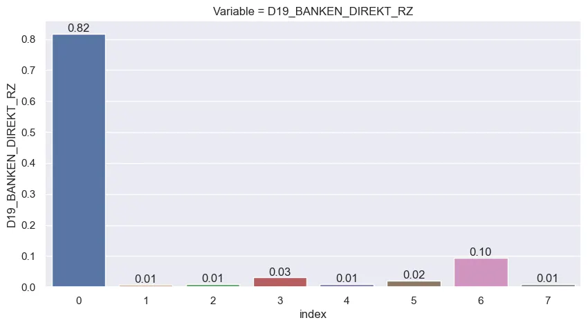
Taking the example above, the consumption variable for banking shows how the answers gravitate between the 0, 3 and 6 values. Accounting other categories could make the space of options too sparse and the combinations of variables would make it even sparser. Keep in mind that there are 36 columns like the one showed above just for its group.
So the next step was to identify the columns that showed this sparsity and reduce it by reducing the number of bins. This affected mainly columns from 2 groups:
- 125 x 125 Grid columns (case illustrated above): from 7 categories, reduced to 4
- D19 columns in the “Household” group: 3 types of columns were identified which had respectively 10, 7 and 10 groups that were reducet to 3, 4 and 3 possible values
The specifics of these alterations will be covered below in the “Preprocessing” stage
Cleaning the Data - Defining Preprocessing Steps
The approach for defining the preprocessing will use as baseline the general population demographic data. This is to ensure that no bias from the customer base or mailout base affect the conclusions or steps taken to clean the data.
The idea is that cleaning steps that apply to the general population, should apply to its subsets since the same variables are present across all files and that all the files are technically a subset of the general population.
Dropping empty rows
Rows that are filled with too many NaNs mean that they might be rows with a lot of imputation. What this results is that we will have rows in which a person might be described a lot by general values of the variables (mean, median, mode, etc.). This automatically might deliver bias to our analysis.
The individuals with highly imputed responses will actually be an “average” (or other imputed value of choice) of all variables. This assumption is not reasonable if most of the data of that response isn’t from that person. We would end up having some “average” individuals
The graph below shows a distribution of amount of rows by proportion of data missing in them. Notice how approximately 10% of the data (orange shaded area) has more than half of their information compromised by NaN values.
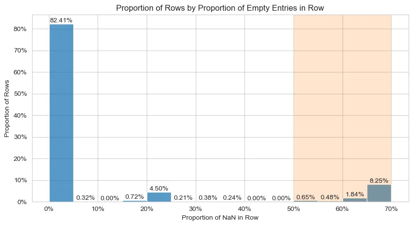 Distribution of proportion of NaN values in the data’s rows
Considering the information the graph displays, rows with more than 30% of its data missing will be discarted.
Re-encoding the relevant numerical variables to binary
As noted in the ETL, some numerical variables had to be encoded to binary. Using a simple np.where is enough to encode the variables the way we need them to.
Fixing Object columns
Some columns are in the object format. This is not inherently a problem. But some columns could benefit from not being object:
- The OST_WEST_KZ is actually a binary column
- The CAMEO_DEU_2015 column could be interpreted as an interval variable.
The fix to OST_WEST_KZ is straightfoward, the column values were mapped to 0 and 1. The CAMEO_DEU_2015 column had 1 integer value mapped to each one of the columns’ possible values. The smaller integer values account for the higher income classifications, the higher account for the lower incomes.
Imputations
The imputation strategy used was separated in two:
- Mode for any categorical variable (interval, nominal or binary variables)
- Mean for numerical
Reencoding D19 Columns
As mentioned in the ETL stage, some columns that start with the “D19” prefix could be reencoded after inspecting their distributions to reduce sparsity in the categories. This led to 4 reencodes:
- Columns from the “125 x 125 Grid” that refered to consumption frequency of a group of goods. They were re-encoded into 4 groups: No transactions, consumed within 12 months, consumed within 24 months and Prospects (> 24 months)
- Columns from the “Household” that refered to the actuality of the last transaction: Activity within the last 12 months, activity older than 12 months, no activity
- Columns from the “Household” that refered to the transaction activity in the last months (12 or 24): No transactions, low activity, increased activity, high activity
- Columns from the “Household” that refered to the percentage of transactions made online: 0% online, 100% online, mixed online-offline (values between 0% and 100%)
All re-encodes were made assigning an int value to each category but always mantaining the logical order of the variable. This was made so that the variables could be interpreted as interval and not simple nominal variables, since they contain an inherent order.
After the ETL and Preprocessing notebooks, all relevant steps were turned into a .py file so that all steps could be equally applied across all files.
Building Customer Segmentation
With the data now cleaned and preprocessed, we can start building our segmentation. This part uses the general census data and the consumer census data. The question we want to answer at this stage is:
Do the possible consumers find themselves in specific segments of the general population?
In a more technical fashion: Given the existance of clusters in the general public data, can the consumers be found more often in specific clusters?
Strategy - Approaching the problem
Given the main question at this stage, the approach had to cover (mainly):
- A Dataset with a high amount of features (300+, possibly more after One-hot encoding the nominal variables);
- A Dataset with mixed-typed data (categorical and numerical);
- A Dataset with a high amount of rows (~800.000 on the general population data);
- Establish a comparison between general population and consumers, given the clusters formed around general population data. Consumer data should not “leak” to form the clusters, since we aim to build clusters around the general population and see how the consumer data “fits” into this reality.
To solve the 1. topic, we would usually go with using a dimensionality reduction method such as PCA. However, given the constraint of the mixed data (topic 2.), we should not use PCA. Using PCA directly on a mixed-data context, would not generate mathematically correct (and thus interpretable) results.
We can look use alternative approaches such as Factorial Analysis of Mixed Data (FAMD). This approach is a form of generalizing Factorial Analysis to a mixed-data setting. The result is similar to PCA. For a more technical and in-depth look into the strategy this article explains the theory and implementation of the method.
FAMD outputs something similar to PCA. This covers the first two main points, handling the amount of features and mixed data. Now for the last two, the solution is pretty straightfoward.
To enable our model to train clusters on the general population and to assign them to the consumer base, we can use clustering methods that will generate centroids. This makes it possible to assign customers to the nearest centroids of the general population. This works because customer data will have the same features as the general population table.
Considering the output of FAMD is a fully numerical table, we can use the well-known K-Means algorithm. But since we need to process 800k + rows across hundreds of columns (which might make some setups runs a little slow), we can use sklearn’s cluster.MiniBatchKMeans that handles confortably the amount of data to give us the results we need.
FAMD
To get the data ready for the FAMD, we create a function to basically One-Hot Encode nominal variables, and weigh these variables accordingly. We also use sklearn’s StandardScaler to handle the numerical attributes accordingly. For this work, interval variables will be considered as numerical attributes and will be handled like numericals.
The FAMD approach used is a manual one (find more about it in the article linked in the previous section). This means that after applying these transformations, we use PCA on the transformed data. The preprocessed data for FAMD, in the end, ends up with 396 features.
So to select the amount of Components we will have, we define an acceptable threshold for the amount of variance we want to keep and then make the transformations. The graph below shows that for a threshold of 95% of variance, selecting 225 components satisfy this criterion.
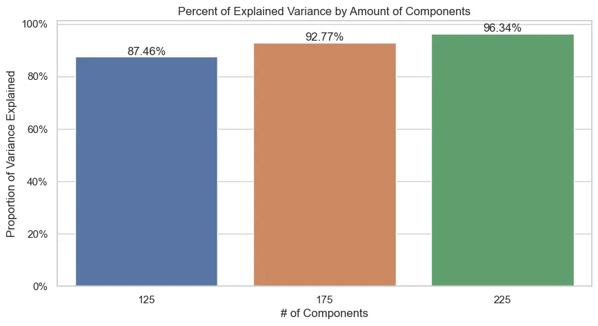
Starting from a higher amount of components and following with bigger steps was a deliberate approach to save processing time.
Mini Batch K-Means
With the transformed data after the FAMD process, we can train the Mini Batch K-Means algorithm and use the elbow method to choose an appropriate amount of clusters:
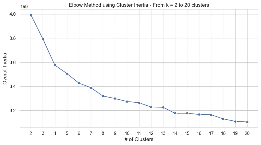
From the graph above, we could select k = 14 as a reasonable amount of clusters for our problem. With the trained FAMD and K-Means objects trained on the overall census data, we now use them on the customer data to then classify data from both files to clusters.
Adjusting Customer Data
To use customer data as intended, we run the same preprocessing we did for the general data and then we will simply use the .transform() from the PCA object and .predict() from the model, both fitted on general population data, to use the customer data.
Neither the PCA or model are re-fitted on customer data to avoid that the customer’s characteristics, which could be differently distributed than the general population, affect the estimates of the cluster centroids or generates Components different from the general population. We want to classify customers according to general population groups and not to consider them jointly.
The code to reuse the customer data with the objects trained on general data will look, generally, like this:
customers = pd.read_parquet(CUSTOMER_PATH)

# Preprocessing function
customers = prep_data_famd(customers, nominal_vars, binary_vars, num_cols)

# Dropping specific columns that aren't used in clustering
X_cust = customers.drop(columns = ['LNR','CUSTOMER_GROUP', 'ONLINE_PURCHASE', 'PRODUCT_GROUP'])

# Are there columns that do not match between the frames?
na_cols = set(census.columns) - set(customers.columns)

print(f'Categories not in customer data but are in census: {na_cols}')

for col in na_cols:

    X_cust[col] = 0

assert set(census.columns.drop('LNR')) == set(X_cust.columns)

X_cust = pca.transform(X_cust[census.columns.drop('LNR')]) # Order needs to be the same

# Assigning clusters to responses
customers['cluster'] = kmeans_model.predict(X_cust)

census['cluster'] = kmeans_model.predict(X)
Results
This process gives us the following distribution in each dataset of responses for k = 14 clusters:
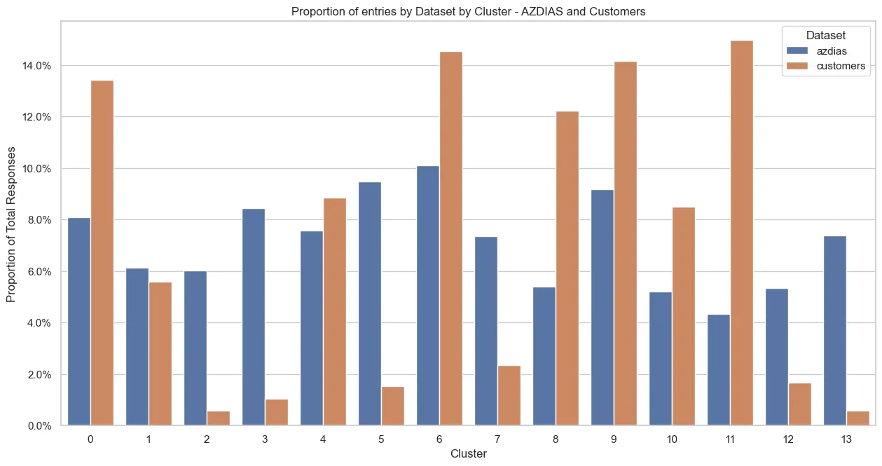
There are clear differences in some clusters! We can see clusters that clearly contain more customer responses than general population responses. Especially the 1, 6, 8, 9 and 11 clusters are clusters that contain a higher proportion of customers.
This already gives us an insight: If we want to find new customers similar to the current customer base, we should target the clusters with a notably larger proportion of responses then the general population. I.e. the clusters mentioned above.
We can go one step further and dig a little bit deeper on the interpretation of the clusters. We will first understand around which components the cluster is more heavily centered around and then look a little into some of the main variables that compose the component.
Let’s take the cluster 11 as an example, since it contains the highest overall proportion of customers in it. More specifically, let’s look into the 3 main components of the cluster.
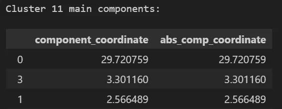 Main components for cluster 11
The cluster is heavily centered at high values in the 0 component, backed up by other components. Here, only the 3 top components will be shown for brevity and as to draw a concrete example of interpretation of the information. But, this analysis could be extended to how many components we would like and all clusters.
Let’s look at the top 10 features in each component 0, 3 and 1:
Component 0
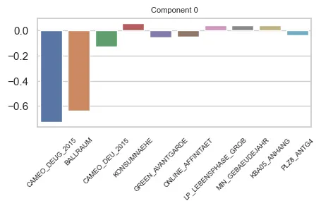 Main features in Component 0
For component 0 we can draw that it has a heavy weight on Economic Class (CAMEO_DEUG_2015, CAMEO_DEU_2015) and distance to nearest city centre (BALLRAUM). Both indicators are inversely proportional to the weight of the component.
These features are interval variables. They have an interpretation that the bigger their value, the lower the income (for CAMEO_… columns) or the farther from the center the respondent is (BALLRAUM). In, general, this component could refer to:
- indiviual income
- distance to urban centers.
Component 3
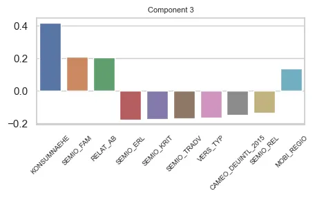 Main features in Component 3
Component 3 seems more balanced in terms of feature impact that component 0. However, a lot of the variables in the component are from the same group (SEMIO_…) and we have a big contribution of the KONSUMNAEHE variable. The component is proportional to this variable. The bigger its value, the further the respondent is from Point of Sale (PoS).
The SEMIO_ variables refer to the mindset of the respondent. Note that the SEMIO_FAM variable has an opposite signal on the effect than the other SEMIO_ variables. This means in practice that the component grows proportionally to SEMIO_FAM, but grows inversely proportionally to the others.
The SEMIO variables have highest affinities (stronger mindset) on lower values. So, for this component, the higher the family mindset, more positive is the component. But, the higher the other mindsets, the more negative it is.
There are also the RELAT_AB and MOBI_REGIO variables, that are about unemployment rates on the surroundings of the respondents and mobility profile of the respondent.
Therefore, we can say that this component refers to:
- The geographical distance of the respondent to a PoS, and;
- The mindset (affinities) of the respondent, towards some themes.
- And has some relation to the respondents’ surroudings employment rates and their mobility profile
Component 1
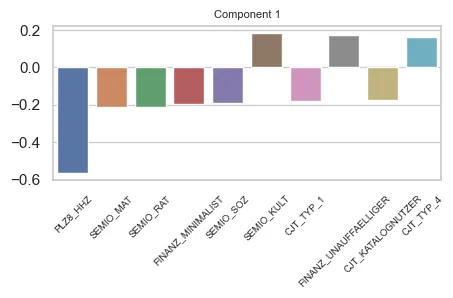 Main features in Component 1
Component 1 shows a heavy contribution of the PLZ_HHZ variable, being inversely proportional to it. We can also see that other SEMIO_ Features contribute to the component, as well as FINANZ_ and CJT_ variables.
HHZ is about housing density on the surroundings of the respondents. The higher the variable’s value, more dense is the region.
The FINANZ_ variables are about how the respondent handles money (finances)
CJT is about Customer Journey Tipology. This means how the customer behaves regarding advertisement consumption and types of Channels used for purchases.
Therefore, we can infer that this component is about:
- If the respondent lives in densly populated regions;
- How the respondents handle their finances (some attributes);
- How the respondents see the world (different themes than Component 3)
- And how they consume ads and which channels they use.
These examples are to illustrate how we could interpret these results towards understanding what is that drives certain clusters. Of course that transformation processes such as FAMD and PCA will add a complexity layer to the interpretation of these informations, since we will have compositions of original features being used.
However, even so we can grasp to some extent what is that drives the components and, consequently, the clusters. After the clustering, we move on the prediction of responses (interaction) to marketing campaigns.
Predicting Customer Response
At this stage we have a different question then that one posed in the segmentation stage:
Can we predict better then a naïve approach the customers that might or might not respond to marketing campaigns?
For this task we will actually use the Test mailout dataset only. This is because its the only dataset that contains labels for predictions.
Strategy - Approaching the problem
Differently from the segmentation phase, when we were handling with an unsupervised problem, now we have a Supervised Classification Machine Learning problem. This means we have labels that we can match correct predictions to. However, the dataset at hand has its specifities.
The labels we are trying to predict come from a column named RESPONSE. It is a binary target. 0 stands for no response, where 1 stands for a response by that individual.
We need to keep in mind that we are dealing with an unbalaced target. This means that the response variable is heavily populated by one of the values. This case, 0. The graph belows illustrates the situation:

In total, after preprocessing, we are left with 435 positive responses versus approx. 34.5k of negative (absence) responses. This means we have about a 1.2% response rate. The remaining 98.8% are people that didn’t respond to the campaign.
It is important to keep in mind that for such an extreme unbalance accuracy is not an option for a good metric in this case. It is a biased metric when we are handling unbalanced datasets.
In short, it is very easy to get a good result for accuracy in an unbalanced setting, since it accounts both True Positives (TP) and True Negatives (TN) as successes. For a more detailed explanation check this article.
So we need a strategy that:
- Handles unbalanced data;
- Uses a metric that quantifies effectively the success of the model;
- Performs better than a baseline naïve approach.
As to topic 1. we have some options. We can use methods that weigh the response variable according to its occurance or we can use artificial sampling methods like SMOTE or Downsampling, both available in imblearn.
Working always from the least to the most complex, testing with methods that weighed the response variable worked well. So this approach was selected.
About topic 2. the solution proposed is using the well known Area Under the Curve for the ROC Operator (ROC-AUC score). This will take into consideration the occurance of the Recall (how many relevant instances we classified correctly) versus the False Positive Rate (how often we misclassified an instance as being a respondent, when it wasn’t).
The third and final topic can only be known for certain known after modelling and comparing results to the test data. So, let’s get into it.
Modelling
To avoid Data Leakage (i.e. test data being used in training) and thus preventing that the model gets information from data it should not have, sklearn’s Pipeline will be used.
The approach selected for better handling the data unbalance was hyperparameter tuning. By default, a lot of algorithms have options to handle this kind of problem.
For the problem at hand, 4 models were used:
- Logistic Regression - Baseline value for comparison (simplest model)
- Decision Tree
- Random Forest
- XGBoost
For the first 3 models, there is the class_weight parameter that sklearn has available for usage. For XGBoost, the scale_pos_weight was used to achieve a similar effect on the XGBoost API.
Also, given that the problem had interval variables (categorical variables with an ordinal relationship) they were approached in two different ways: first, using them as numerical variables; second, using them as ordinal variables. For the first case, these variables were handled as numeric. For the second, they were handled by an OneHotEncoder.
In general, the numerical variables were Standardized because, although not needed by the methods, we would be able to test the models with regularization.
Also, considering the unbalance, all Cross Validations for results were made with StratifiedKFold to assure target balance.
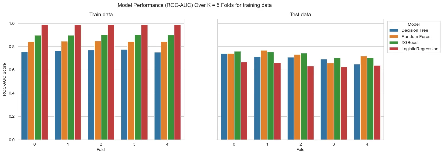
Results - Test Data
We want to first compare what strategy we will use: encode or not the interval variables. This is because variables of this type are the majority of the data. How we use them can impact the results.
Secondly, we want to see if the models we choose will have results good enough to justify Hyperparameter Tuning. We will compare the results from the other models to Logistic Regression performance.
To start we split the train and test data. Then, setting up the pipelines with initial versions of the models, we run them only using the training data inside cross_validation and evaluate the comparative performance of the models. The results are the following:
For the interval variables being used as numeric:

For the interval variables being one-hot encoded:


On a first glance, the models seem to overfit. However, we must consider we have a heavy unbalance at hand. So, what can actually be happening is that we don’t have enough samples to generalize well to test data. This means that this heavy difference of results could be result of the amount of available information.
Also, on this first run, the models aren’t with any sort of hyperparameter tuning. This can heavily affect the results. Tree depth or regularization, for instance, are parameters that affect a lot these kinds of models.
All the models outperform the Logistic Regression on test data.
Also, the strategy of using interval variables as One Hot Encoded features seem to wield better results. However, the results are only slightly better. So, as a counterproof, we will run both strategies for all models to tune hyperparameters.
IMPORTANT: In this past section “test data” refers to a subset of training data!
When we run the final models against the actual test data, we can assess if they actually overfit or yield bad results.
Hyperparameter Tuning
With the results from before, we will do hyperparameter tuning for the Decision Tree, Random Forest and XGBoost in both cases of usage of the interval variables. The tuning took place with the following parameters:
dt_params = {'DT__max_depth':[2,3,5,6],
             'DT__min_samples_split':[2,5,10],
             'DT__min_samples_leaf':[1,3,5]}

rf_params = {'RF__n_estimators':[100,200],
             'RF__max_depth':[2,3,4]}

xgb_params = {'XGB__n_estimators':[100,150],
              'XGB__max_depth':[2,3],
              'XGB__learning_rate':[0.1,0.2],
              'XGB__alpha':[0,1,2.5]}
For the tuning, only training data was used and the Stratified K-fold cross validation was kept.
Mean AUC-Score results for the interval variables used as numerical:

Mean AUC-Score results for the interval variables used as categorical:

From the scores, we get that in general the variables used as categorical (One-Hot Encoded) yielded better results. However, the difference in results are still really close. To assure we don’t discard useful models, they will be tested on the test data to see their generalization power.
Final Run: Results on test data
Now, running the models with data never seen we can actually assess if there is indeed overfitting taking place or not. If the results on test data never seen is a lot lower than on the training stages, then overfiitting might be a possibility.
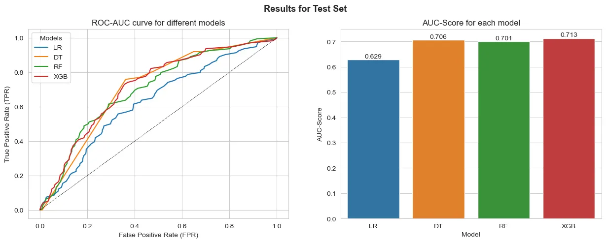
Results for the interval variables used as numerical:
Results for the interval variables used as categorical:
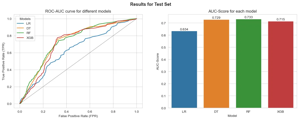
From the results the model that best generalizes to the test data is the Random Forest with One-Hot Encoded interval variables. We can also see that the results are similar to those obtained on the predictions over the training data. This points that the difference might not be necessarily overfitting, but actually the model’s capability to generalize well to the data at hand.
However, the results point to a better performance when comparing any model to a naïve Logistic Regression.
Conclusions
We can see that it was possible to predict the respondents using ML approaches successfully. All models outperformed a naïve Logistic Regression baseline.
The best model had the following variables as the most important for predicting results:
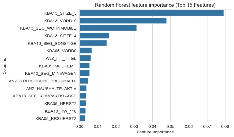
We can notice that informations regarding car ownership (KBA13…) and some general counts of the households (ANZ…) appear often.
From these results, we could potentially use this model to pinpoint which customers could be targeted by future marketing endeavors.
Some improvements could be thought of for future development cycles such as:
- Feature selection, removing highly correlated features to increase perfomance and reduce any redundancies the models might capture.
- Rerunning the clustering with selected features. This might enable us to cluster without recurring to FAMD method and thus making the interpretation of the cluster easier.
- Rerunning the models with more data available: given the unbalance, to improve the models generalization capabilities, using more data would be optimal to achieve substantially better results.
Thanks for reading!
Here is the repo for the project.
This article is also available on Medium.
If you have any feedback or just want to get in touch, DM on LinkedIn.